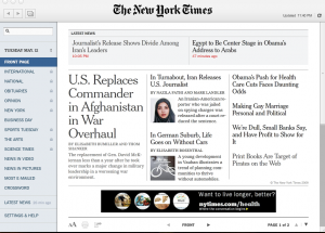
One of the most common complaints from newspaper readers is that no digital format can equal the aesthetic of reading a newspaper in print. The argument is that computer screens are either too bright, too small or just too plain difficult to use for enjoyable reading. I must confess that I’ve been somewhat of a disciple of this idea myself, but after using the new version of the New York Times Reader my print nostalgia is officially cured.
 Designed by Adobe Air–who share some of their insights via video–the application offers the perfect confluence of print and digital features. In the words of Wired Columnist Ryan Singel, “Journalism’s grey lady, the New York Times just threw down her cane and sprinted to the forefront of online newspapers.”
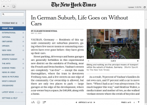
The reader’s interface is painstakingly clean. Headlines appear on the main page and on the left navigation a list of sections similar to a newspaper table of contents reside. The text has the look and feel of a print newspaper, but the hyperlinks and the convenient navigation of a news website. Plopped down in the middle of my desktop, it felt as natural as reading a newspaper on a wooden desk; actually it felt a lot better.
The reader is an application that anyone can download for free, temporarily. The free download gets you a healthy portion of NYT content, but for $15 bucks a month you can get it all. It’s totally worth it. The reader updates approximately every five minutes with new content. It also gives you a week’s worth of content archives packaged by date. So, just like a print newspaper, when you click on May 10, you get a digital newspaper from May 10.
If there is a flaw in the design, it’s that there is no way to be able to easily bookmark content. It would be fabulous if somehow Delicious or another bookmarking application could be integrated into the reader.
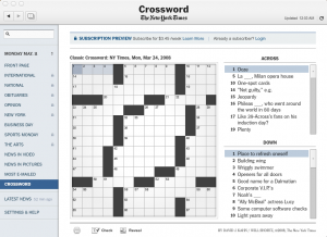
Regardless, I congratulate The Times for creating such a great product. There are so many different models to retrieve news online now–social bookmarking websites, Twitter, Facebook, RSS readers, etc–that often we overlook the fact that a news organization might be able organize its own content intuitively as well. The Times has accomplished that and more, and hopefully others take notice. Meanwhile, I’m signing up for a subscription stat. (Oh, did I mention you can even fill in the crosswords via your computer!)


“for $15 bucks a month you can get it all. It’s totally worth it.”
I just installed it and I’m failing to see how this technology couldn’t be incorporated into a web page with Adobe Flash. In fact, you could probably recreate most of this with pure CSS and a few RRS feeds from the Times.
Adobe wants you to buy their AIR SDK and NYT wants you to buy a subscription. How is this not just another cross-marketing ploy reminiscent of Spider-Man in a Happy Meal. Where’s the beef?
I appreciate innovation in news but selling it with terms like nostalgia seems a bit ironical.